Custom Banners are a great way to advertise for your business.
You can get them in basically all shapes and sizes and they can say or depict anything that you want them to. Because of this, custom banners are a very versatile form of advertisement. They are also cost effective and something that you can use over and over and design new ones as your needs change. There are however many things to consider when designing a custom banner for your business.
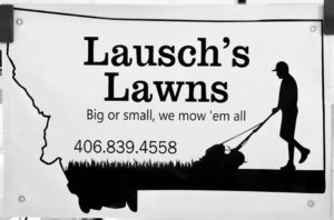
Because of the size and shape of banners, they need to be readable at a glance, sometimes from a distance. Even if you are familiar with designing other forms of advertisements, there are a few aspects to designing a great banner that will determine how successful the banner is in advertising your business. Anybody can design a simple banner, but designing one that stands out and conveys your brand and your message easily, to the largest amount of people is a bit of an art-form.
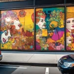
One of the first things you need to consider is the placement of your banner. It may seem like a silly aspect to think about, but placement will determine the design of your banner, not only for the size, but also for the color scheme etc. You want the colors to contrast in comparison to its location, so that it stands out as much as possible. You don’t want your banner to blend in and have people miss your message simply because you used the wrong color scheme.
Large text is another must when it comes to designing your banner. Again, it may seem elementary, but you would be surprised as to how many people try to cram too much onto their banner and end up using smaller text as a result. This in turn makes it difficult for your customers to read your message, especially at a glance. You can say more when you are designing a flyer or a leaflet. Don’t try and say too much when you are designing your banner.
Along those same lines, big, bold fonts are almost always the best way to go. It is always tempting to get fancy and use some off the wall, flamboyant font, but remember, readability is everything when it comes to banners. You are not going for style points, you are just trying to make sure that your message gets across to your customers. For the most part, bold sans-serif fonts are what you want to use because they are the most readable on a banner. You may get away with something like Times New Roman as well, but don’t try to get much more complicated than that.

While you are making your banner readable with a big, bold font, remember to keep your message simple. Again, there is always a tendency to overdo it. Don’t. People are going to be reading your banner at a glance. If it is too wordy, many times they just won’t bother. Don’t use big, complicated words, and try to remove anything that is not completely necessary. Communicate to your customers in as simple a way as you possibly can.
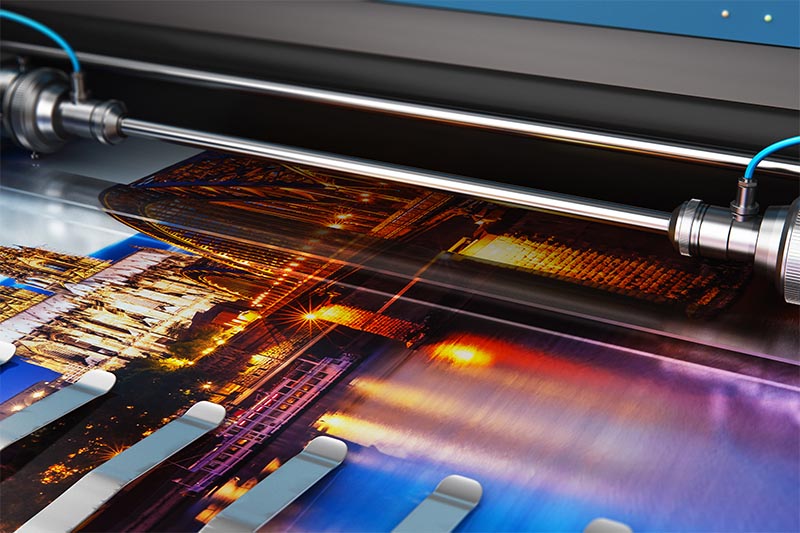
If you are using graphics or pics, make sure they are of high quality. There is nothing worse than putting a picture on a banner and using something that is not of high resolution. A great resource for high resolution stock is Adobe Stock.
It will make your banner look cheap and unprofessional. A great looking, high quality graphic or picture is an excellent thing to use when designing a banner and it will catch people’s eye if done correctly. Just make sure you are using something that adds to your message rather than distracts from it.
It is also important to get your message across with your custom banner, but to keep your brand in mind as well. Don’t try to get clever with a message that doesn’t necessarily fit with your every day business. Stick with simple messages that will get clients to seek you out. Keep the continuity of your brand in mind when designing your banner so that people think of your business when they think about your particular product or service. Remember, not everyone is going to call you at the time they see your banner. You want your message and/or name to stick in their head so that when it’s time to make the call, they think of you.
Lastly, you will also want to make sure you choose appropriate colors. Different colors bring different things to mind and evoke different reactions in your clients.
Make sure you use colors that are appropriate for the message you are trying to get across:
- Red is generally associated with passion, anger, excitement, speed, and love. This is a powerful color that should be used in moderation.
- Not as overpowering as red, orange is associated with happiness. It is inviting and friendly and just a little more mellow than red.
- Yellow is usually associated with energy, sunshine, and optimism. It will capture a viewer’s attention and should be used in moderation much like red.
- Green is associated with health, freshness, and things to do with the environment. It tends to be the easiest color on the eyes and should be used to convey growth and new beginnings. It is also closely associated with money.
- Blue generally means trust and safety. It can also have to do with freshness, cold, and masculinity.
- Pink is associated with love, babies and is generally considered to be a feminine color.
- Purple is associated with royalty, luxury, wisdom, and often magic.
- Because black is associated with evil, power, mystery, and formality, it is usually best utilized as a text color when it comes to banners.
- White is associated with cleanliness, purity, and honesty and goodness. White will usually be a background color on your banner and is used to offset other more emotional colors.
- Gray is neutrality and practicality. Gray is best used to contrast or intensify other colors.


